work
Clean Branding for a Sustainable Water Brand
Client
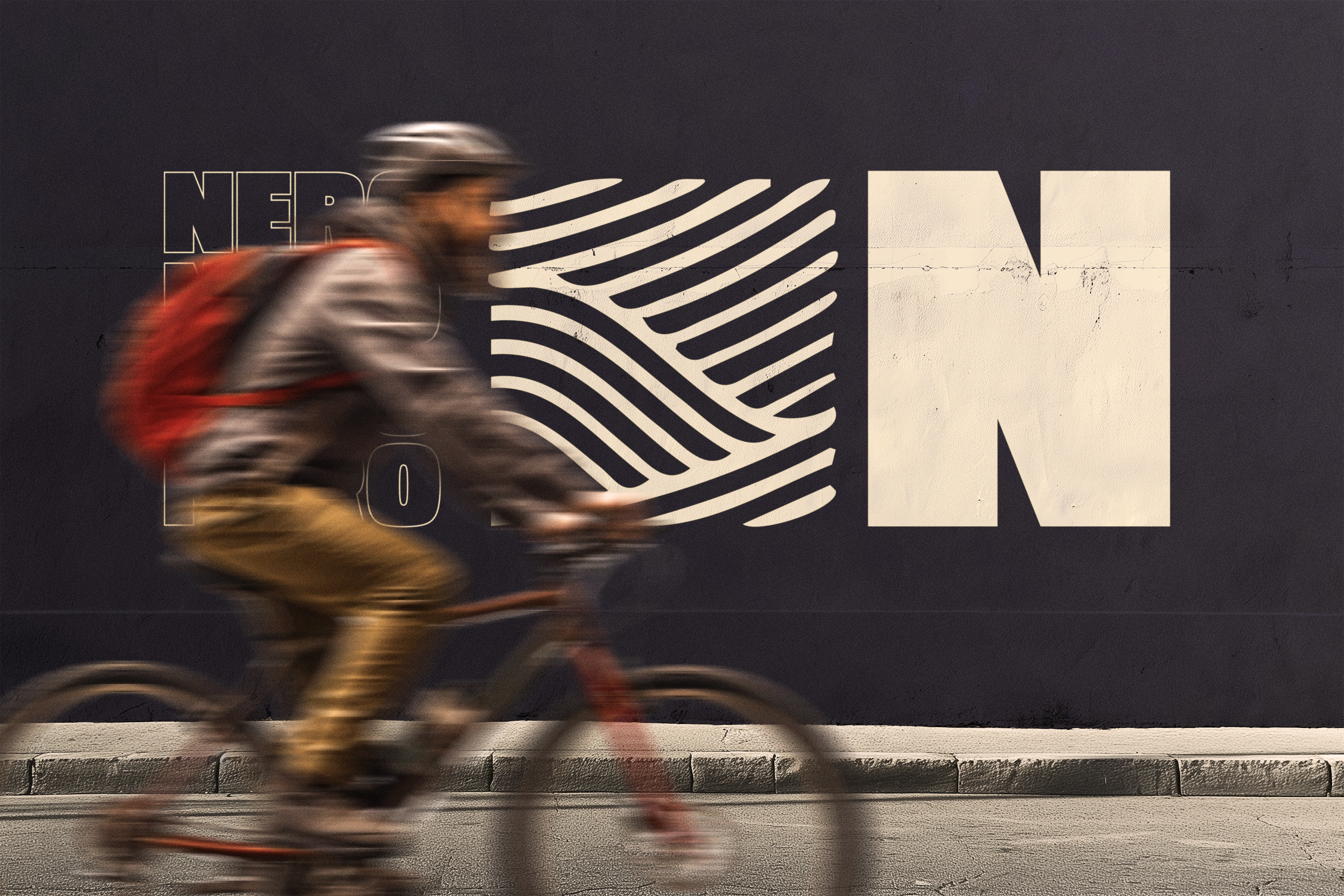
Nero
Service
Brand Identity
Year
2024
No items found.
Introduction
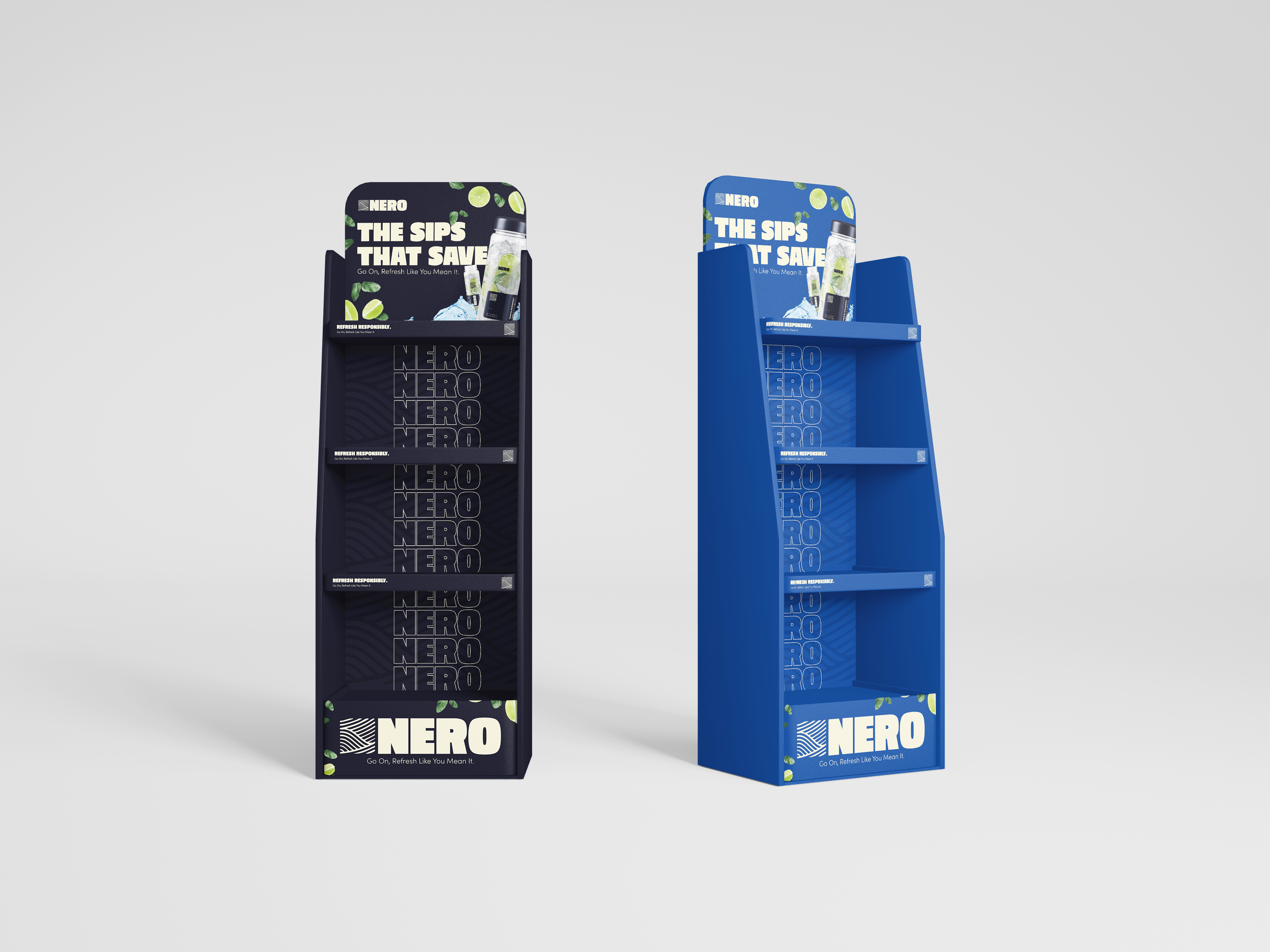
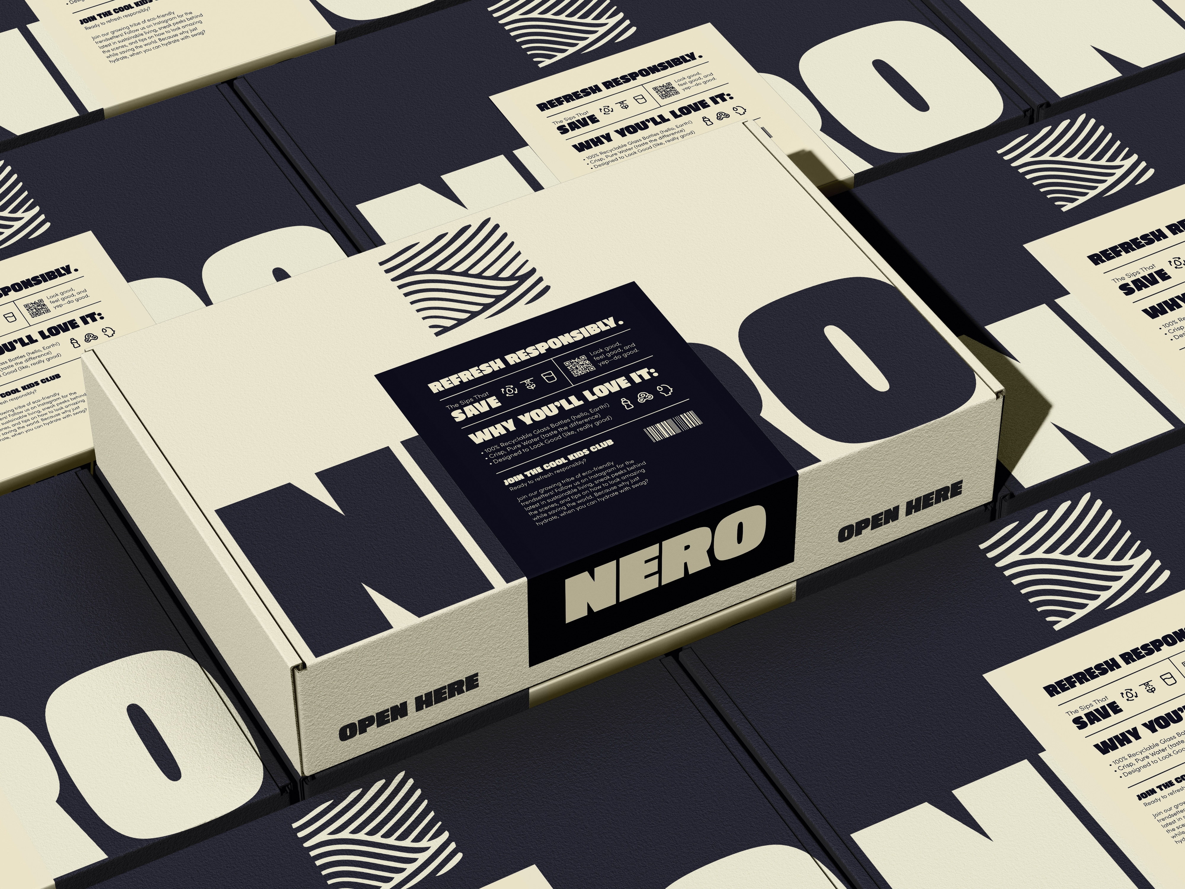
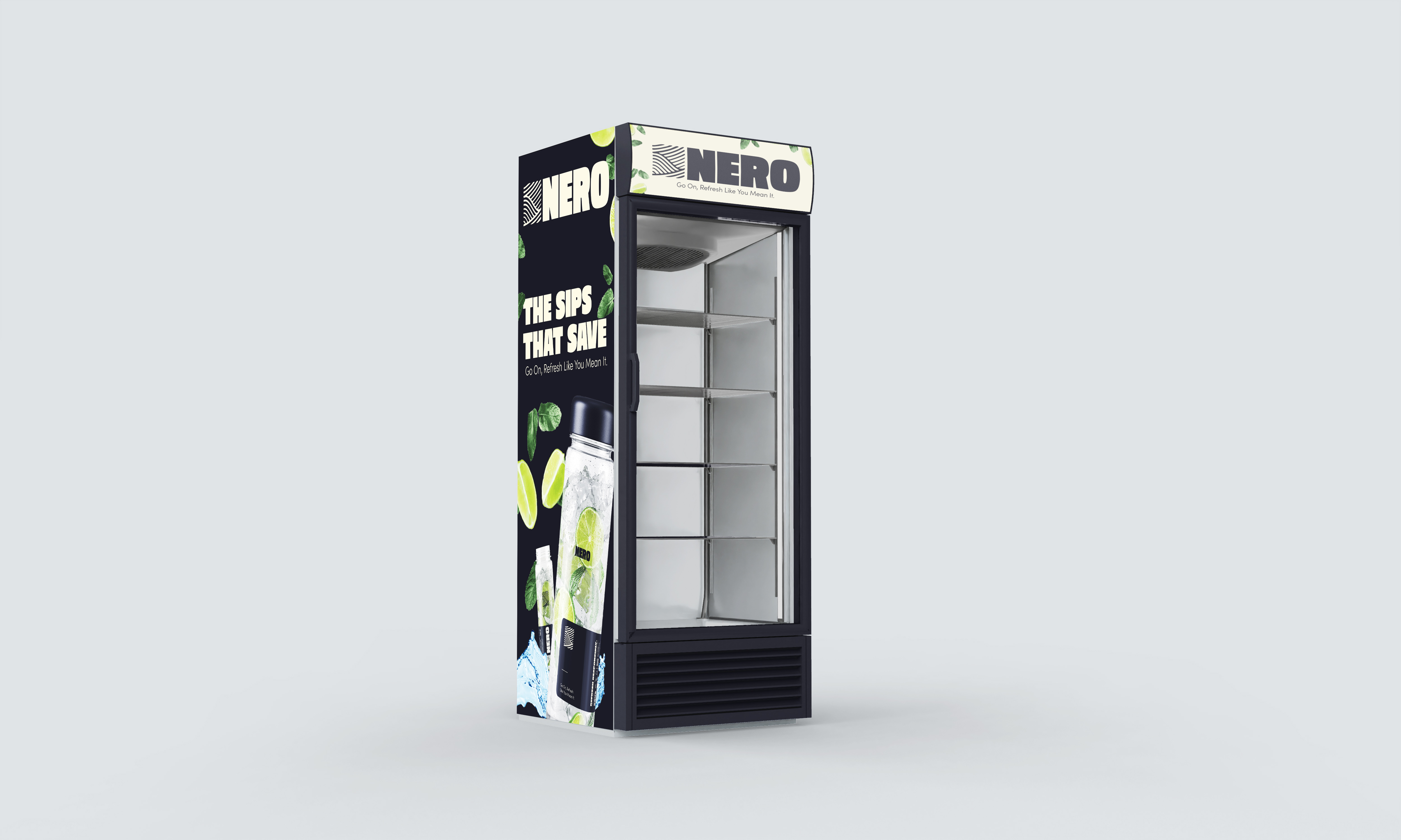
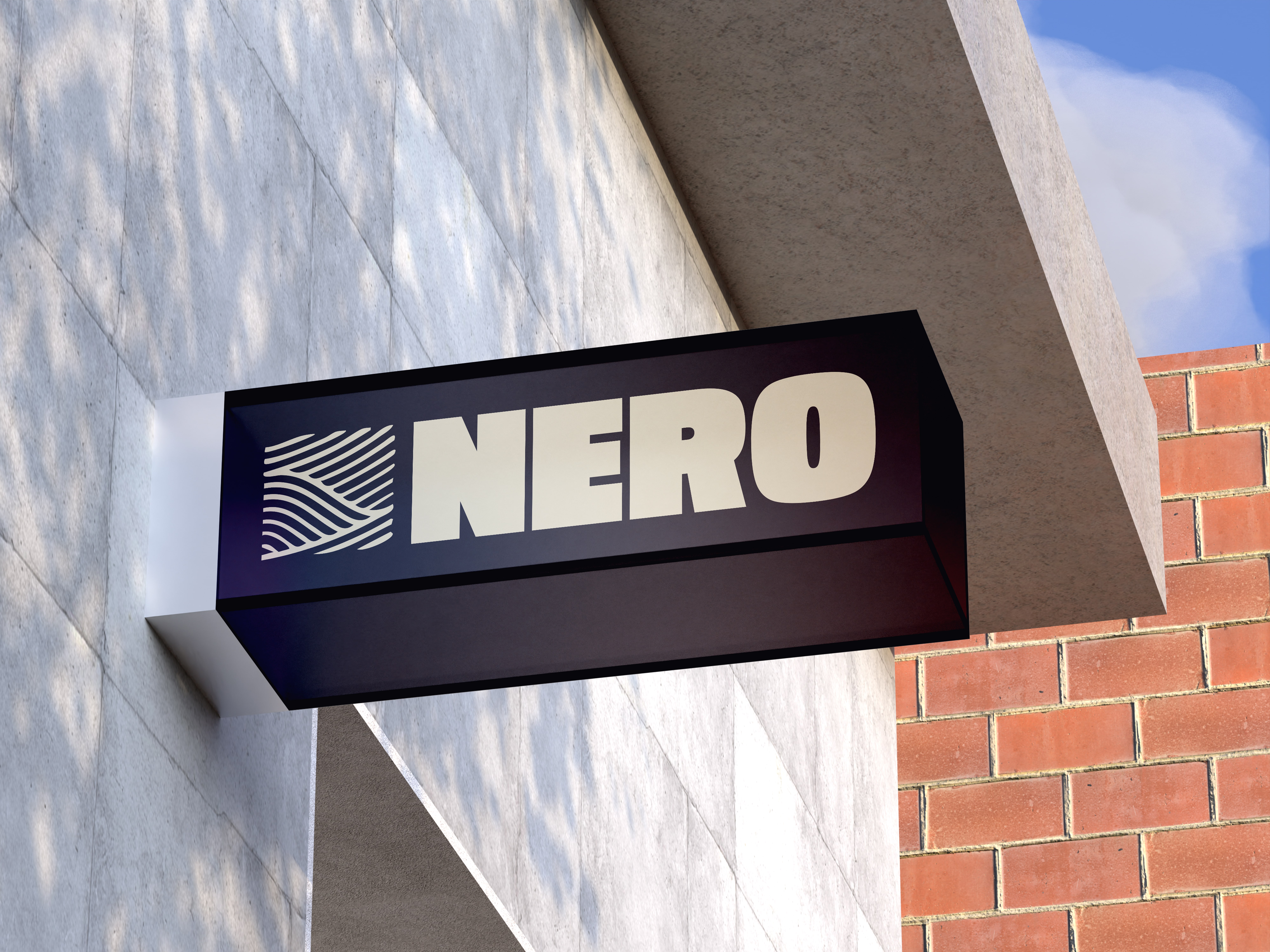
Nero is a premium glass-bottled water brand built on sustainability, simplicity, and thoughtful design. The challenge was to create a brand system and digital experience that communicated purity and purpose, while standing out in a saturated market. The visual identity pairs minimalist design with eco-conscious messaging, while the Webflow-built site brings the brand to life through smooth interactions, elegant typography, and a focus on storytelling.
No items found.
What I did
I led the development of Nero’s brand identity, logo design, color palette, type system, and visual direction, followed by the design and build of a responsive Webflow site. The site features product highlights, sustainability messaging, and an intentional layout that reflects the calm, clean nature of the brand. The result is a cohesive brand presence that flows seamlessly from packaging to web.